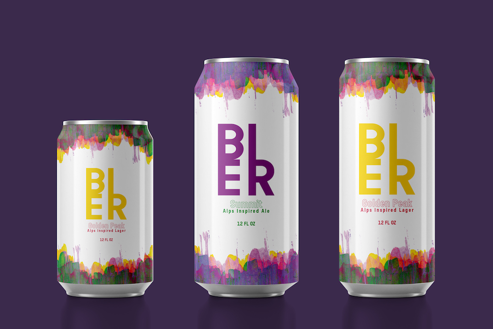
A craft beer identity rooted in Alpine character — bold, honest and made for the mountains.
Overview
APPROACH
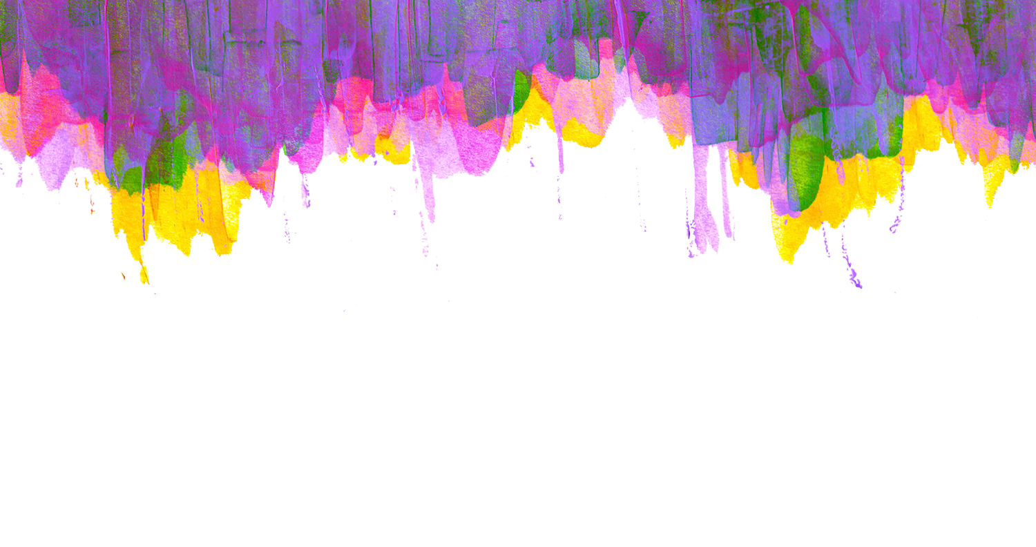
The Alps are many things — dramatic, vast, quietly majestic — but above all, they are layered. That idea of depth and strata became the starting point for BIER: not just a mountain silhouette, but something more felt than seen. The brief was simple — create a canned beer that carries the spirit of alpine landscape.
CONCEPT
Rather than depicting the Alps directly, the design abstracts them through colour and texture. Working with acrylic paint, layers were built up one on top of the other — each one a different hue. The result is a pattern that reads as mountains layered without ever showing one: organic, vibrant, and unmistakably alpine. This became the face of BIER.
EXECUTION
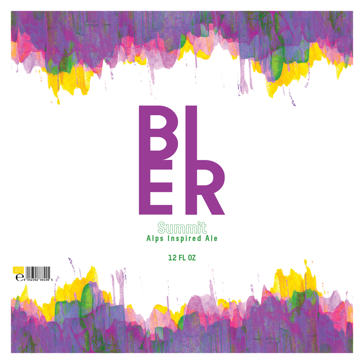
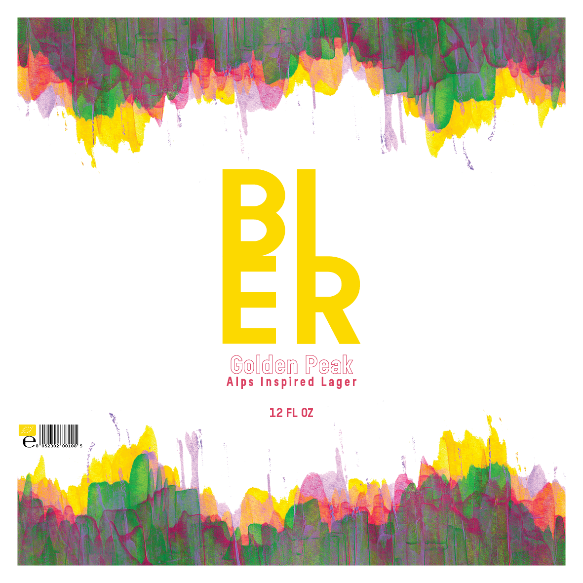
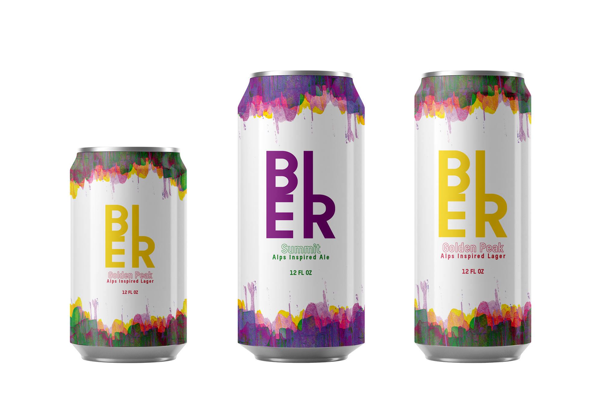
The layered acrylic pattern was translated into the full visual system of the can — label, wrap, and overall identity. The palette feels alive and expansive rather than static.
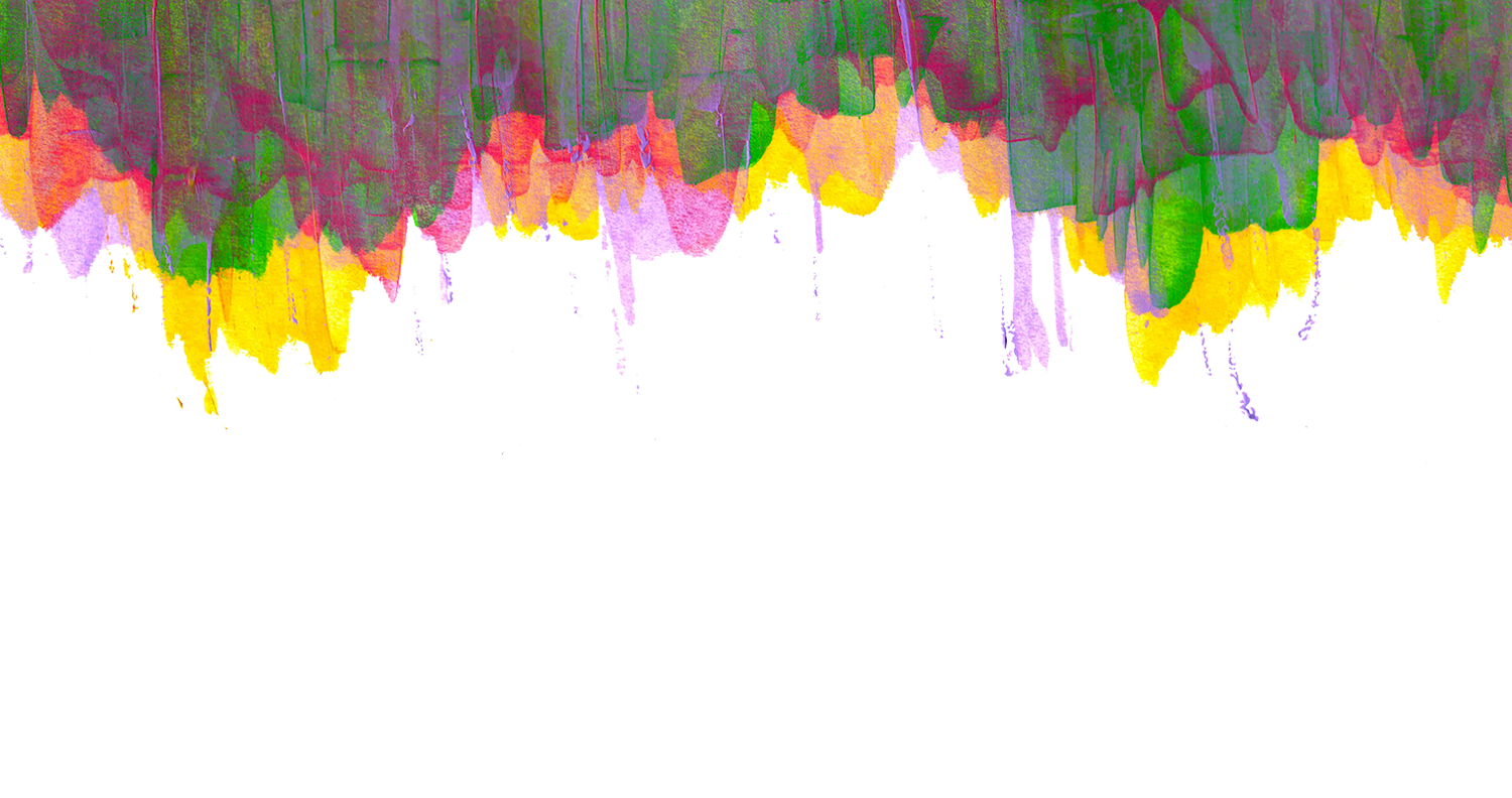
To begin, the design is created to depict the shape of the alps, peaks emerging from the earth, evoking the strength of them. The texture and overlapping colours create a vivid yet harmonious combination.