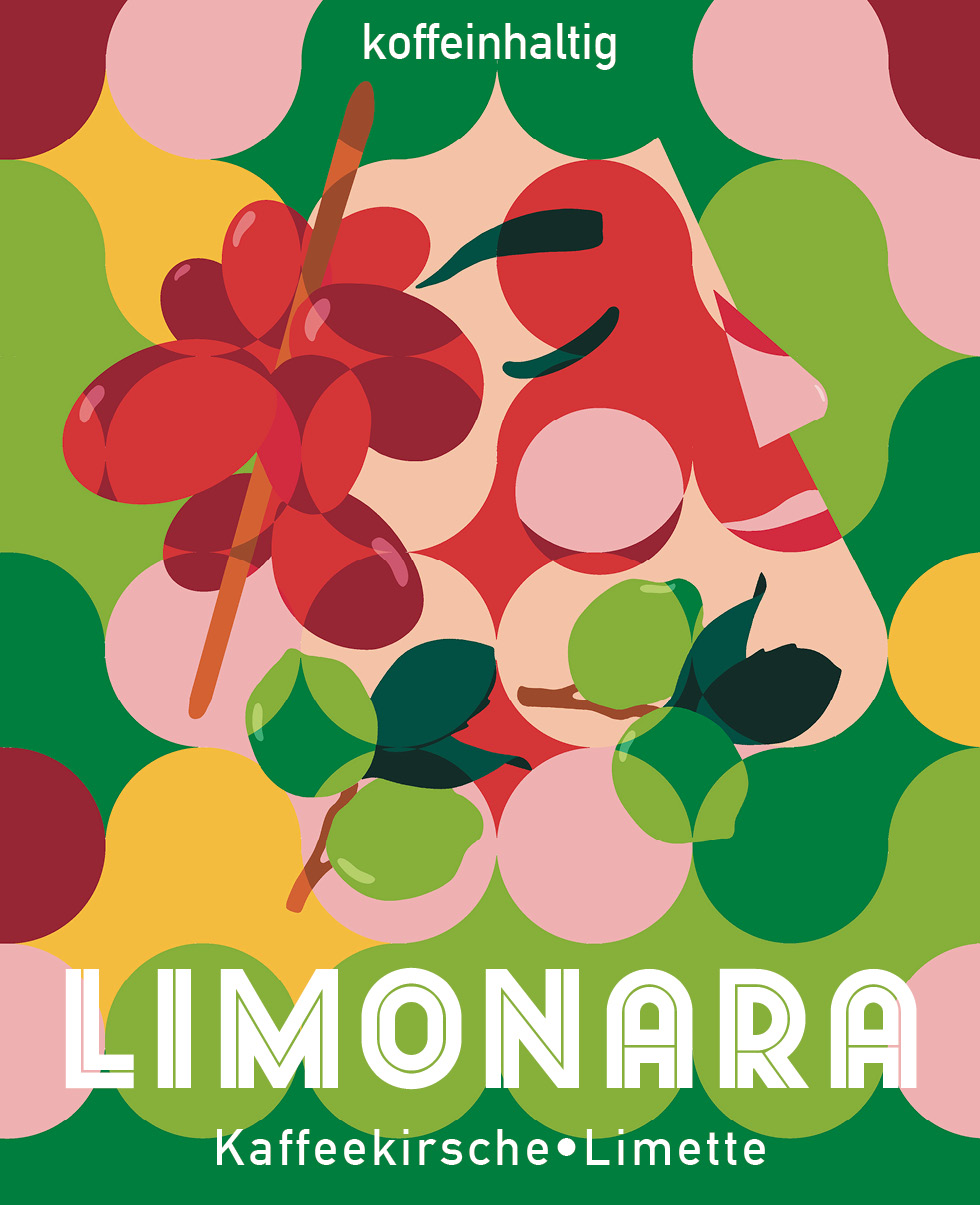
A label design for a drink that defies expectations — where fresh lime meets coffee cascara.
Overview
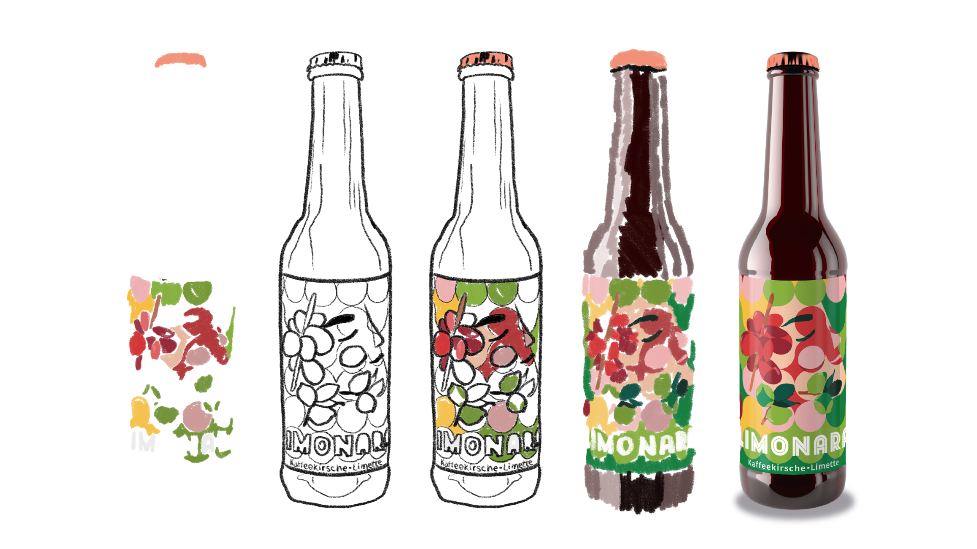
APPROACH
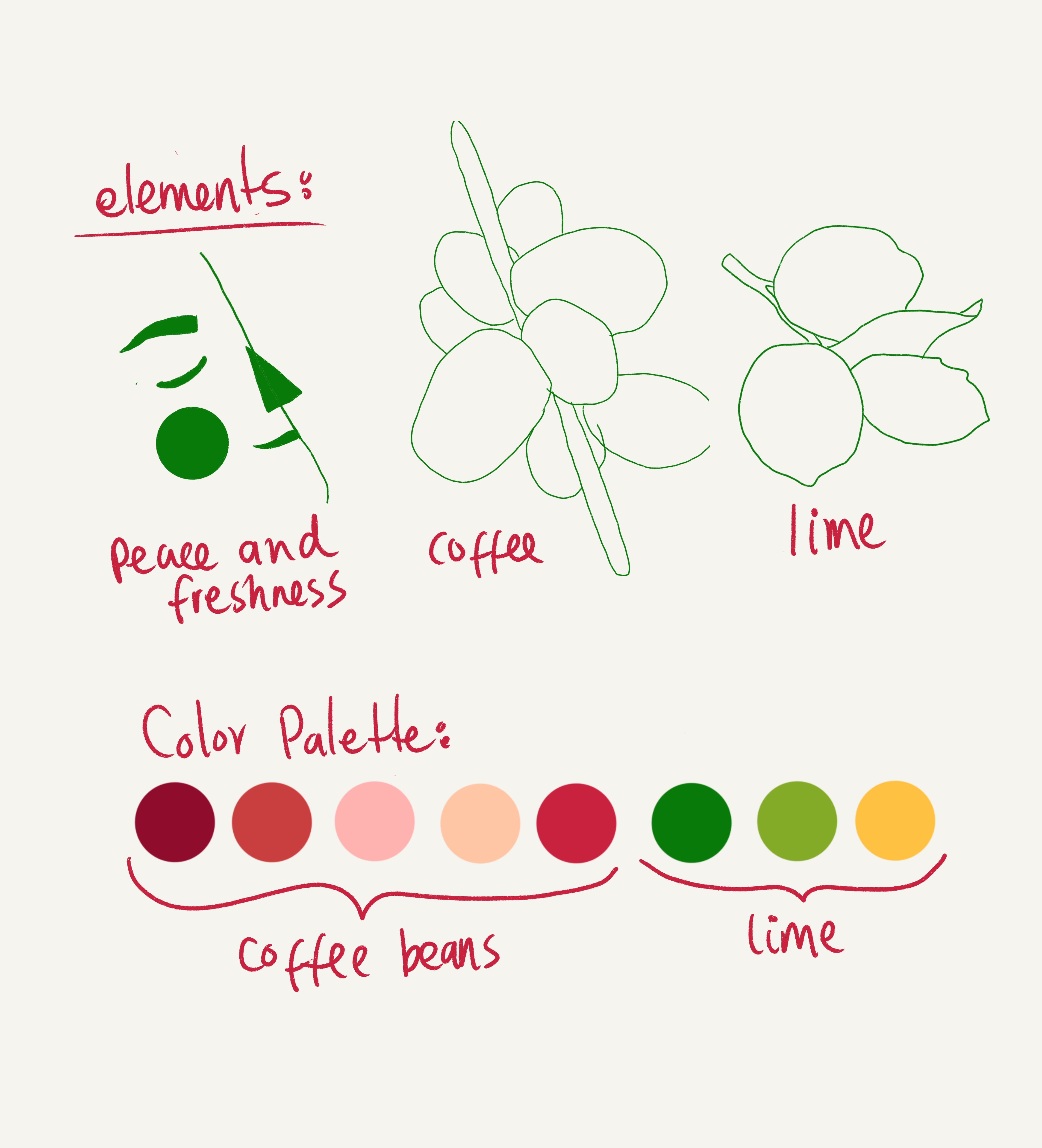
It all started with a taste. Before sketching anything, I sat with the drink and let the flavors speak — The label needed to match the beverage energy.
CONCEPT
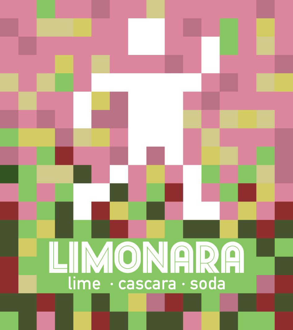
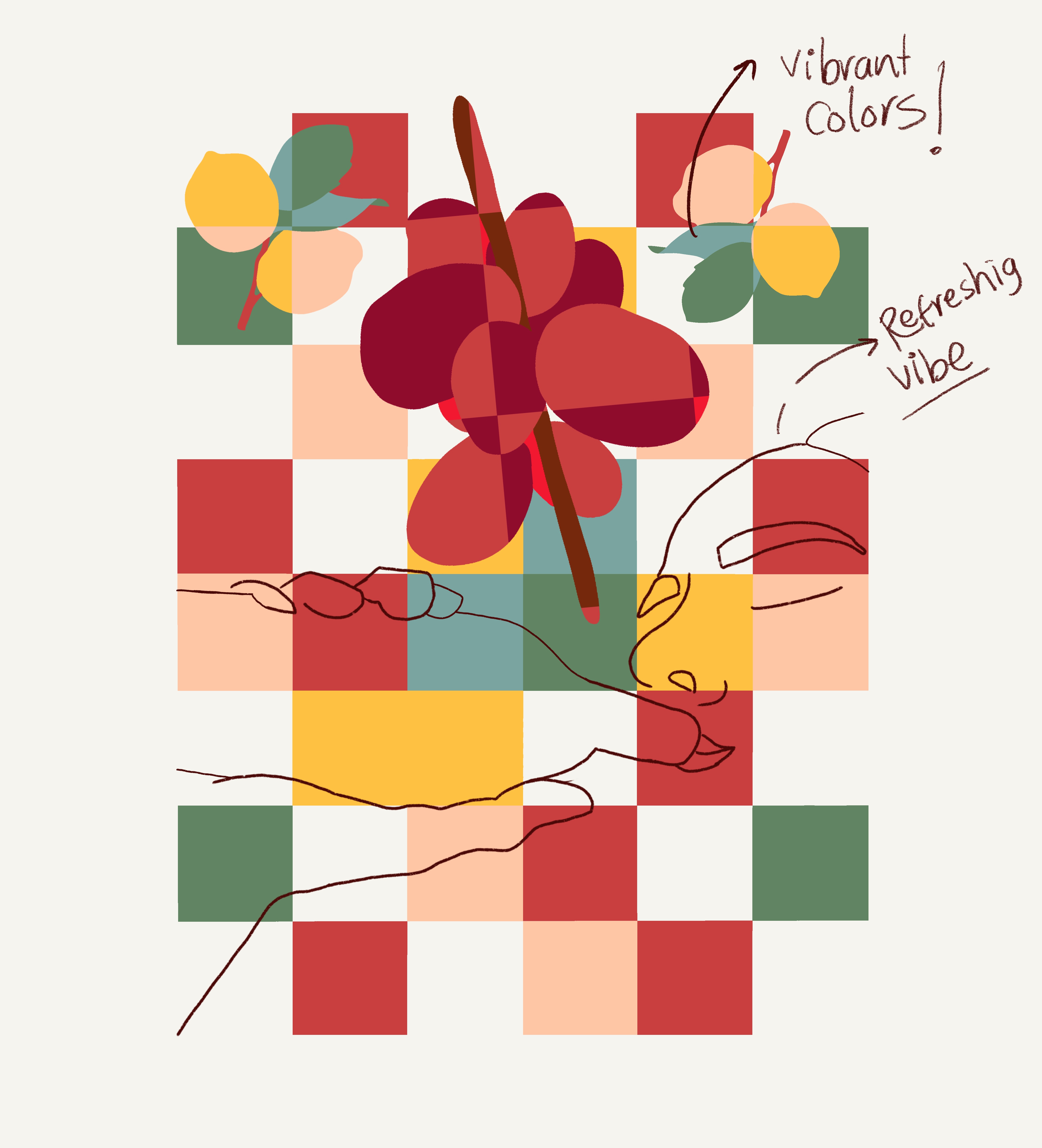
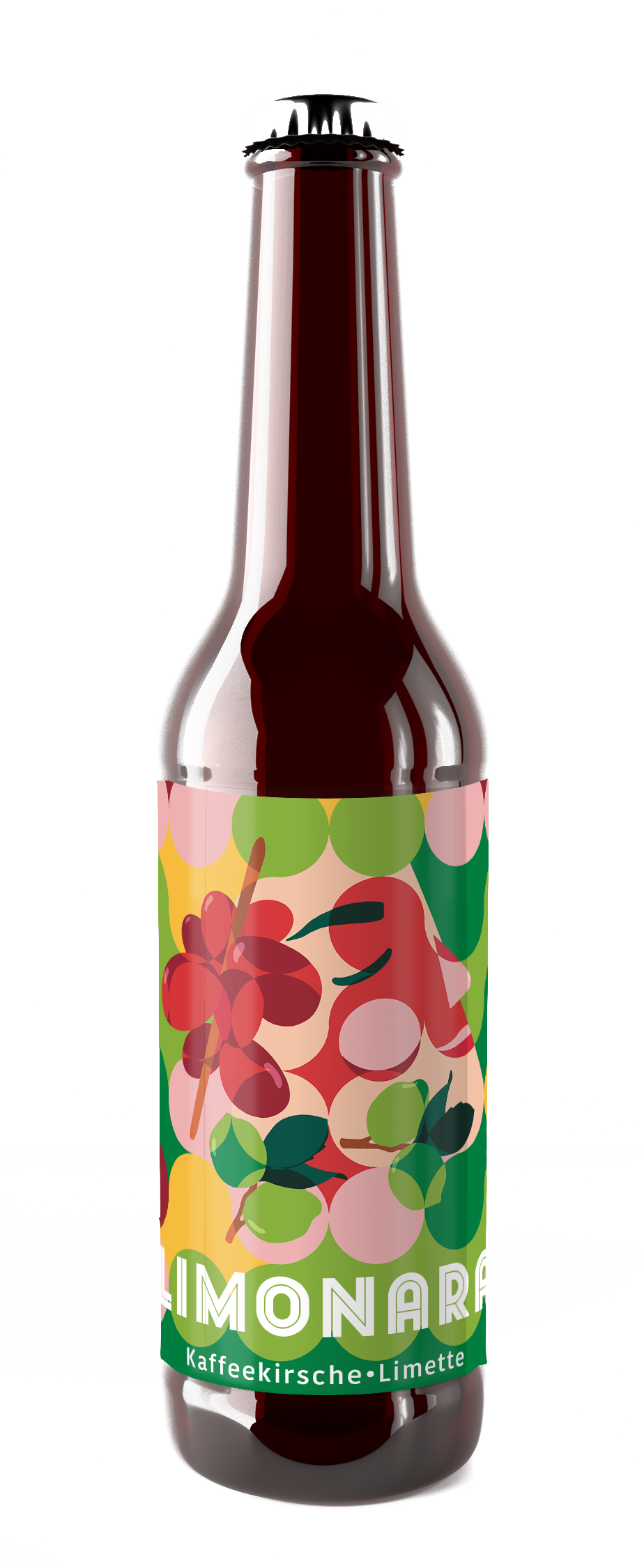
I looked straight to the source: the coffee tree. Its natural palette — warm terracottas, deep greens, yellow hues — became the visual foundation. The design started with a squared grid, but something felt too rigid. Rounding it into a circular grid was the moment it clicked — suddenly the whole thing felt lighter, more inviting, bubbly, more Limonara.
EXCECUTION
The final label is expressive and feels alive. It seems playful, and genuinely refreshing — just like the drink it belongs to.